White Space
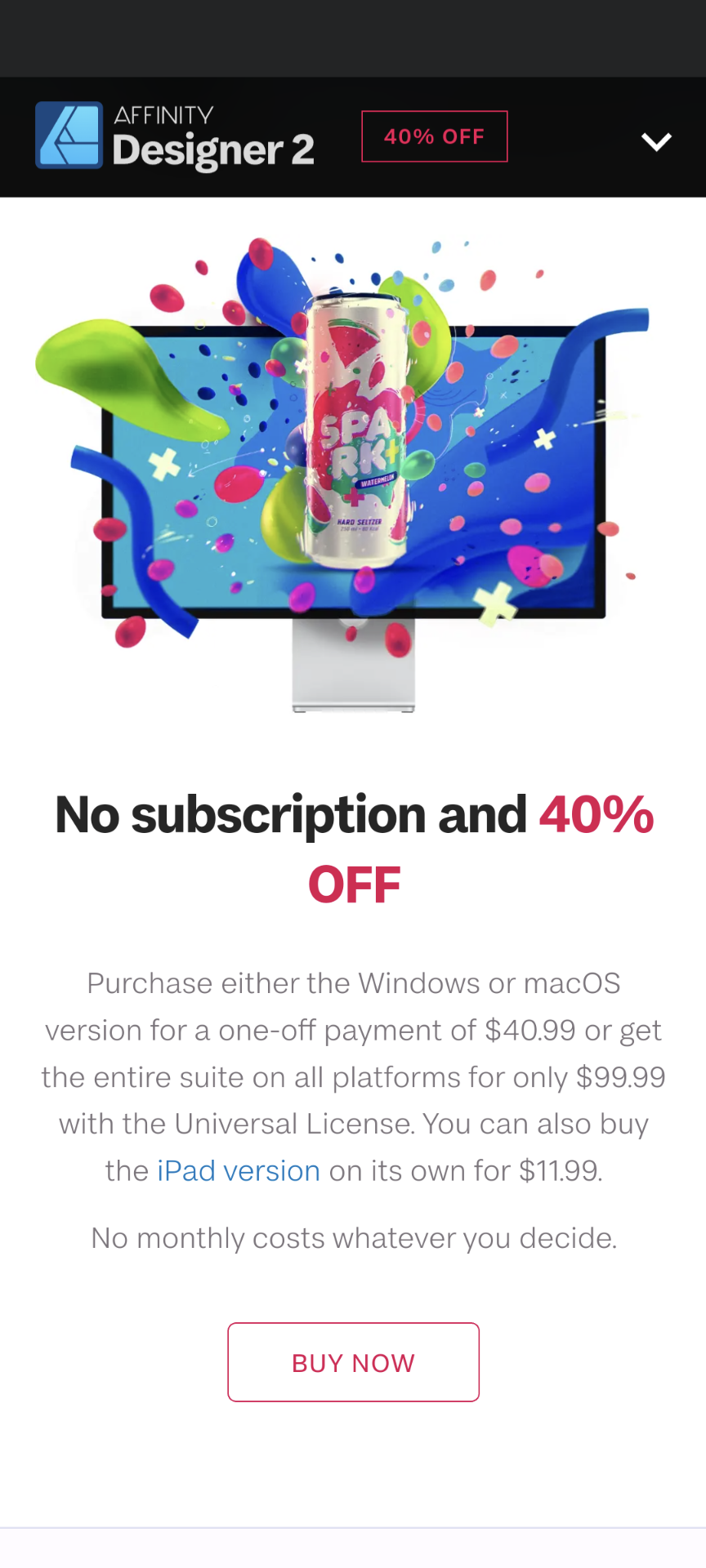
Serif
Serif does a good job with making white space for their marketing and showcasing of Affinity Designer. Similar to other industry leaders like Apple, Serif provides generous room around text, images, buttons, and banners which helps to provide focus on what is important. It also gives the page a modern look which helps to show their software in a better light.
Contrast
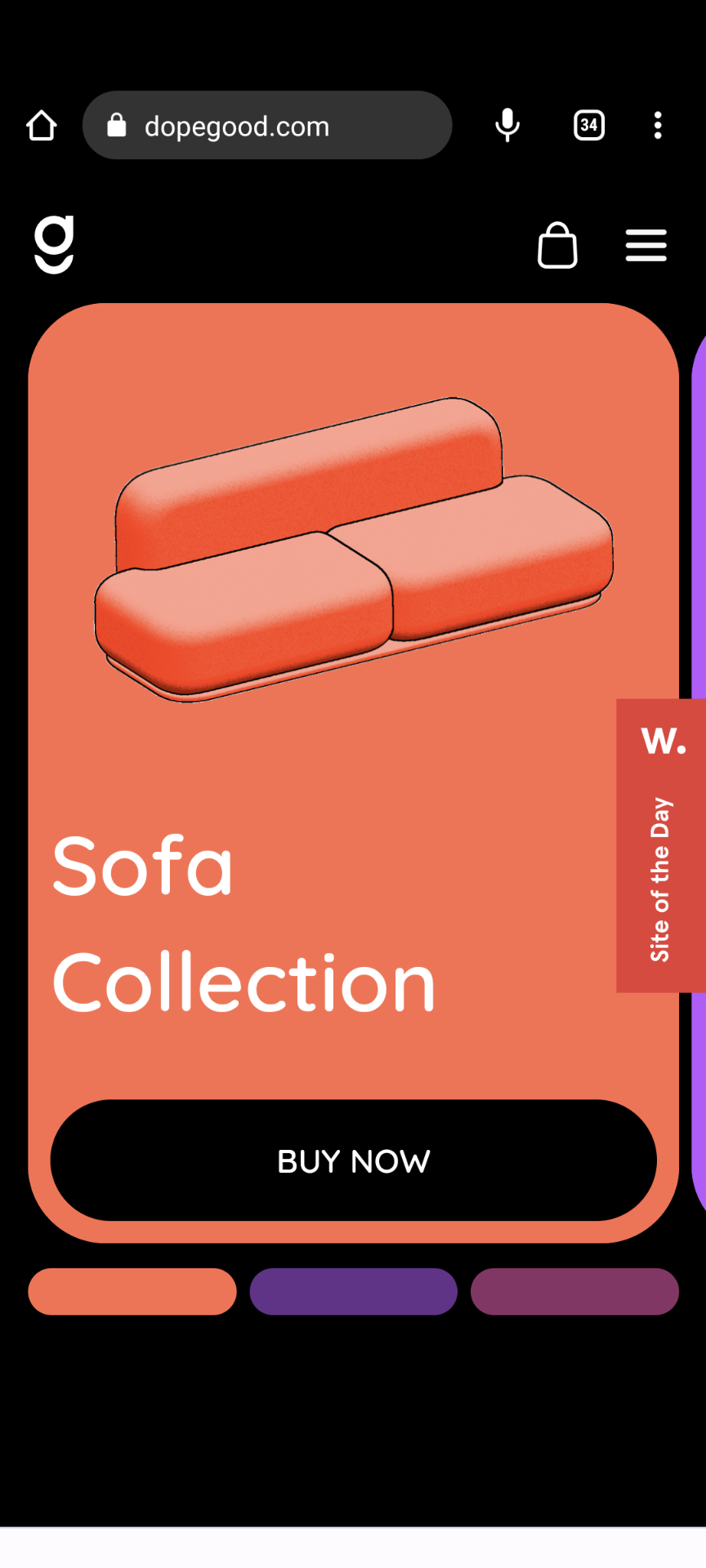
Dopegood
Constrast is the primary element used by Dopegood to achieve the viewers attention. Their catalog is built with bright colors which provides an excellent contrast from the black background used throughout design.
Alignment
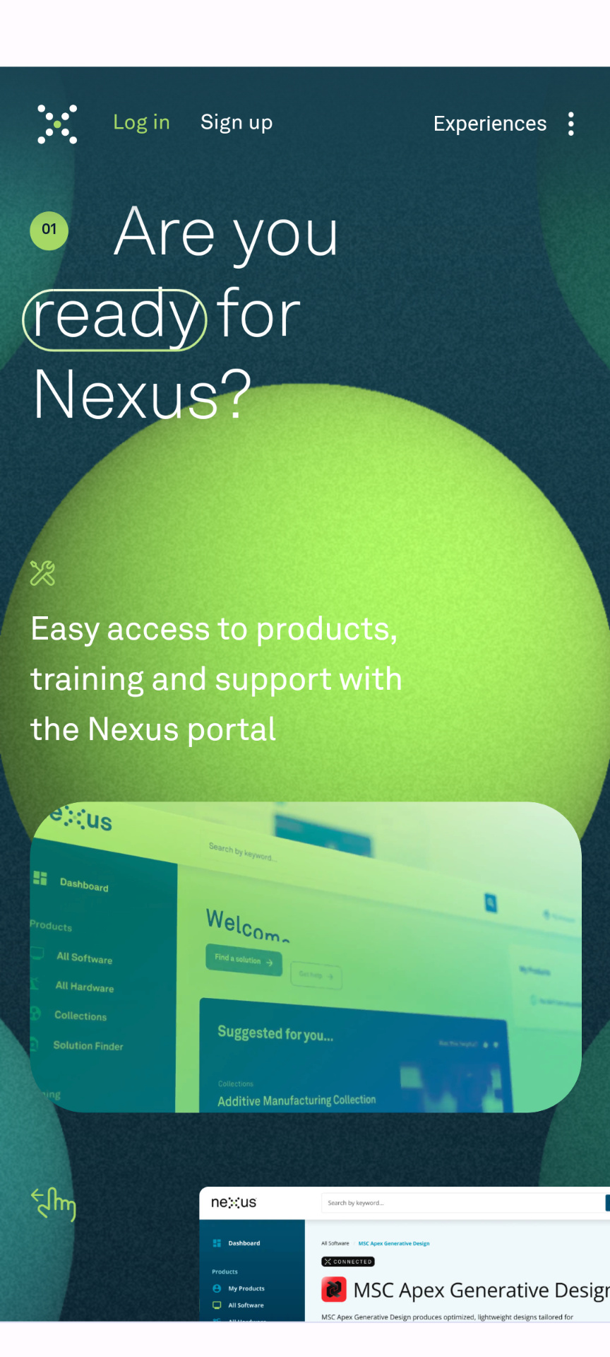
Hexagon
Alignment can be hard to pull off with a design like Nexus from Hexagon, however, they do a great job of providing balance to the whole experience. Many objects are left aligned. Others are placed right to show contrast such as iamges. This gives hierarchy to the elements in the design.